Demystifying the Yield Curve

If you have spent a fair amount of time perusing news from the financial media, from outlets such as Bloomberg, FT, etc., then it is likely that you have come across the term “yield curve” in some of your readings. I imagine that most people are not particularly familiar with what a yield curve even is, I know I wasn’t when I first came across the topic. The objective of this post is to help the reader gain a better understanding of what a yield curve is, why it is important, and how it is used by investors. Please note that this post will explain the subject as I have come to understand it.
What is a yield curve?
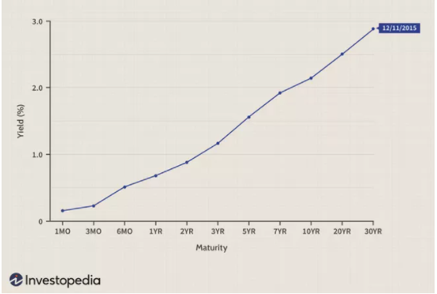
A yield curve illustrates the differences between bond yields of varying maturities (i.e. 5-year, 10-year, etc.) at a point in time. For example, the illustration below captures the yield curve on 12/11/15. The curve is constructed by plotting the yields of bonds based on time to maturity.
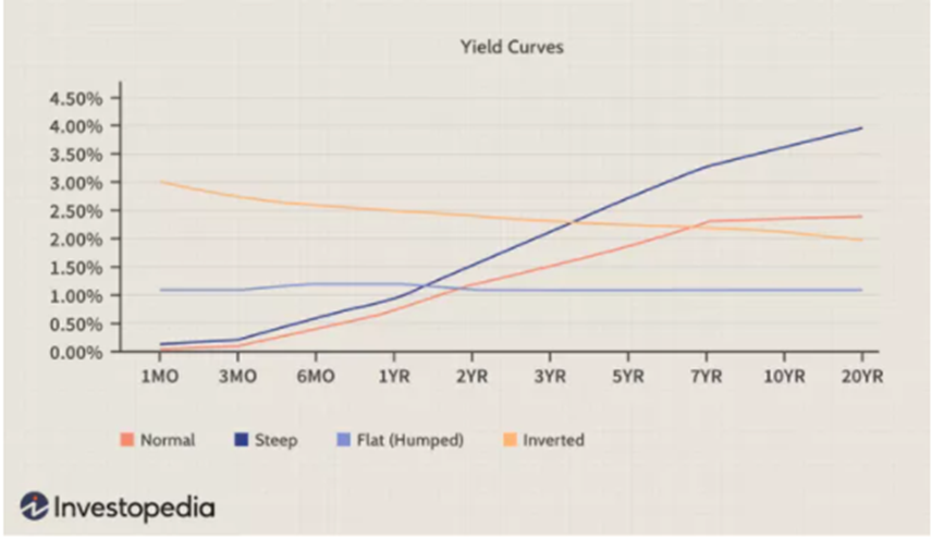
Within the context of the yield curve itself there are some important terms the reader should understand: steep, flat, and inverted. A steep yield curve occurs when the yield on the longer-term bonds is significantly higher than the yield on shorter-term bonds. A flat, or flattening, curve is when the difference between the yields on long and short bonds becomes minimal or compressed. And finally, an inverted yield curve is when the yield on long term bonds is below the yield on short term bonds. An illustration of each type of curve is provided below.
The importance and application of these terms will be discussed next.
Why is the yield curve important?
The yield curve provides information to help us better understand what the bond market is trying to tell us about growth and inflation expectations in the economy over both shorter and longer time frames. For example, when the yield curve inverts (more on that in the next section) this implies that growth and inflation expectations are more robust in the short run than the long run.
Despite getting much less attention than the stock market, the bond market, where our data for yield curve construction is derived, is actually considerably larger. In the U.S. alone, the bond market's value in 2017 was estimated at $40.7 trillion, a number that is sure to be much larger today since debt issuance has increased while yields have declined. In comparison, the stock market’s value was estimated to be about $30 trillion.
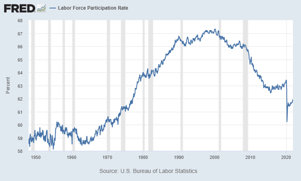
The bond market in general also tends to be far more in line with what is actually going on in the real economy. When rates are low this means money is tight and that lending growth is expected to remain poor; conversely, when interest rates are high this means money is loose and that lending will be more robust (if more money is sloshing around in the economy, higher rates become more tolerable). For example, bond yields have collapsed since 2008 and the labor force participation rate (a far more honest measure of the employment situation) has collapsed with it (image below).
The ideal yield curve is one that is steep and upward sloping which means that long term growth and inflation expectations are expected to improve over time. In a practical sense, if one is an entrepreneur thinking of starting a new business then it is imperative that you have an idea of what the economy is going to look like 1, 2, or 10 years down the road. The yield curve is a handy tool for forecasting such things.
How is the yield curve used by investors?
The most popular yield curve that traders and analysts pay the most attention to is the 2/10 yield curve which plots the difference, over time, between the yield of the 10-year and 2-year note. For example, on January 7, 2022 the 10-year yield was 1.76% while the 2-year yield was 0.87% for a difference of 0.89% or 89 basis points. The 10/2 yield curve is provided below along with a zoomed in version of the last 5 years. Note that the term “spread” on the y-axis pertains to the difference in yield between the 10-year and 2-year notes going back to 1976.
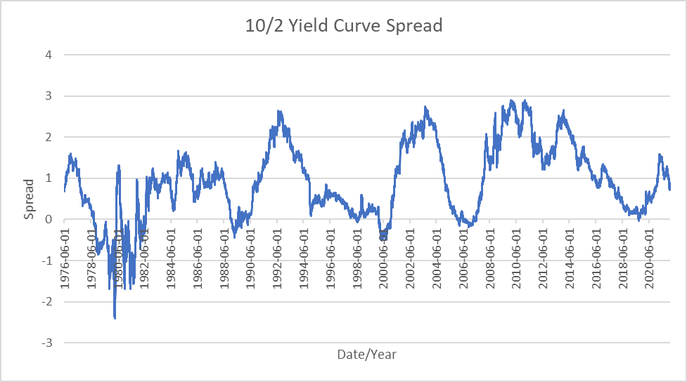
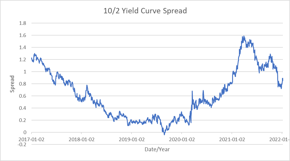
In the financial media, the observation that draws the most attention is when the yield curve inverts (in our example this means that the yield on the 10-year note drops below that of the 2-year). But why is this an important signpost for investors? If we observe the top chart and focus on the inversions (line dipping below 0) a pattern emerges. For example, the yield curve inverted in 1998 and then again in early January of 2000. Both of these inversions preceded the popping of the Dot.com bubble. Likewise, from 2005 through 2007 the yield curve inverted again and only a short time later the GFC was upon us. It would again invert, if for only a few days, in 2019 which preceded the Covid-19 recession by about 6 months. Thus, the inversion of the yield curve signifies that liquidity is drying up and/or that the economy is beginning to slow, an important signal that has a tendency to tell the observer that a topping formation in the market is not far off. To a lesser degree, the continued flattening of the yield curve more or less suggests the same.
Current Applications
Due to the high CPI prints of 6 and 7%, there is a growing concern that we are moving into an extremely inflationary environment. However, interest rates in the bond market are still some of the lowest on record and reached their local peaks back in March of 2021 meaning that the bond market doesn’t see what all the fuss is about and is predicting much lower growth and inflation in the future. As an aside, it is important that the reader is aware that most of what is responsible for pushing the CPI to such high levels has to do with damaged supply chains but not money printing and the bond market is correctly pointing this out.
Hopefully the reader now not only understands what a yield curve is but can identify and understand what the bond market is telling us through the different shapes that it may take i.e. steep, flat, and inverted. Always remember that the Fed is a small fish in a big pond. While multi-billion dollar purchases of securities may seem like a lot, this figure is paltry compared to the sheer size of the bond market itself and has little effect. In order to make good financial decisions in general it is important to avoid the noise and look for the signal, which often means going against the herd.
Enjoying these posts? Subscribe for more
Subscribe nowAlready have an account? Sign in